Pest Control SaaS Project
Pest Control SaaS Project
Client
Algorithus
Year
2024
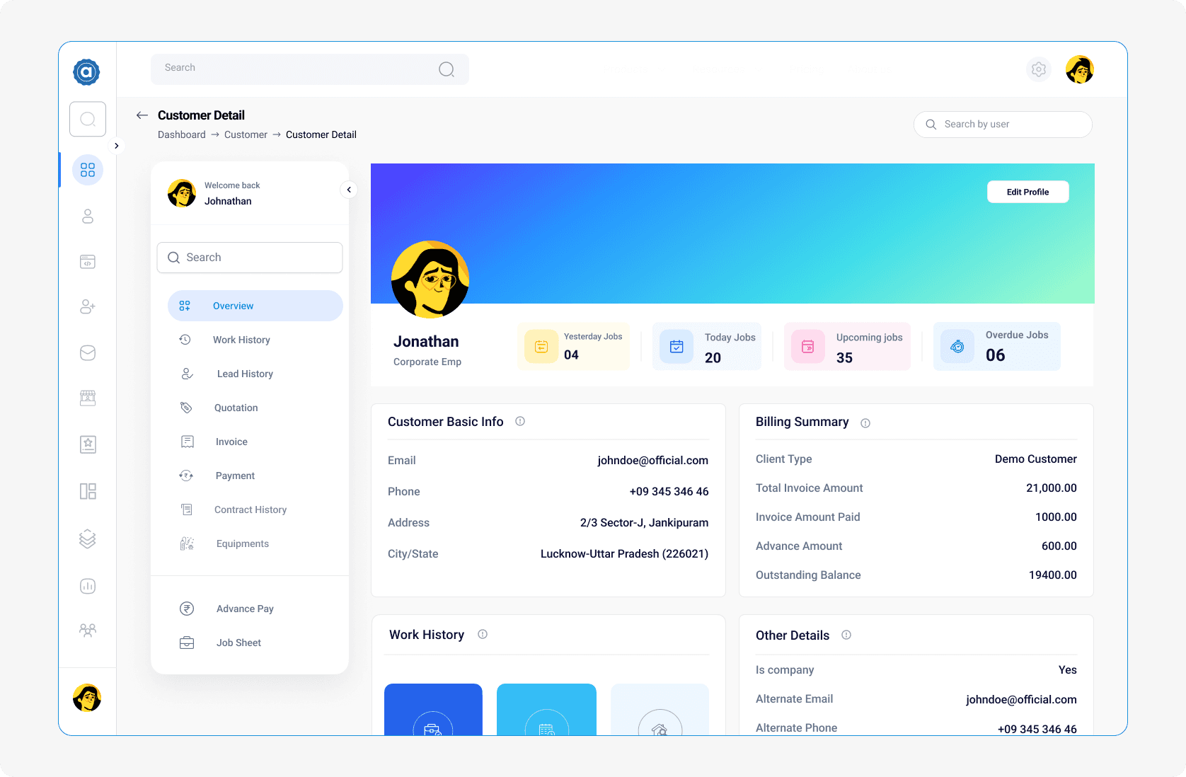
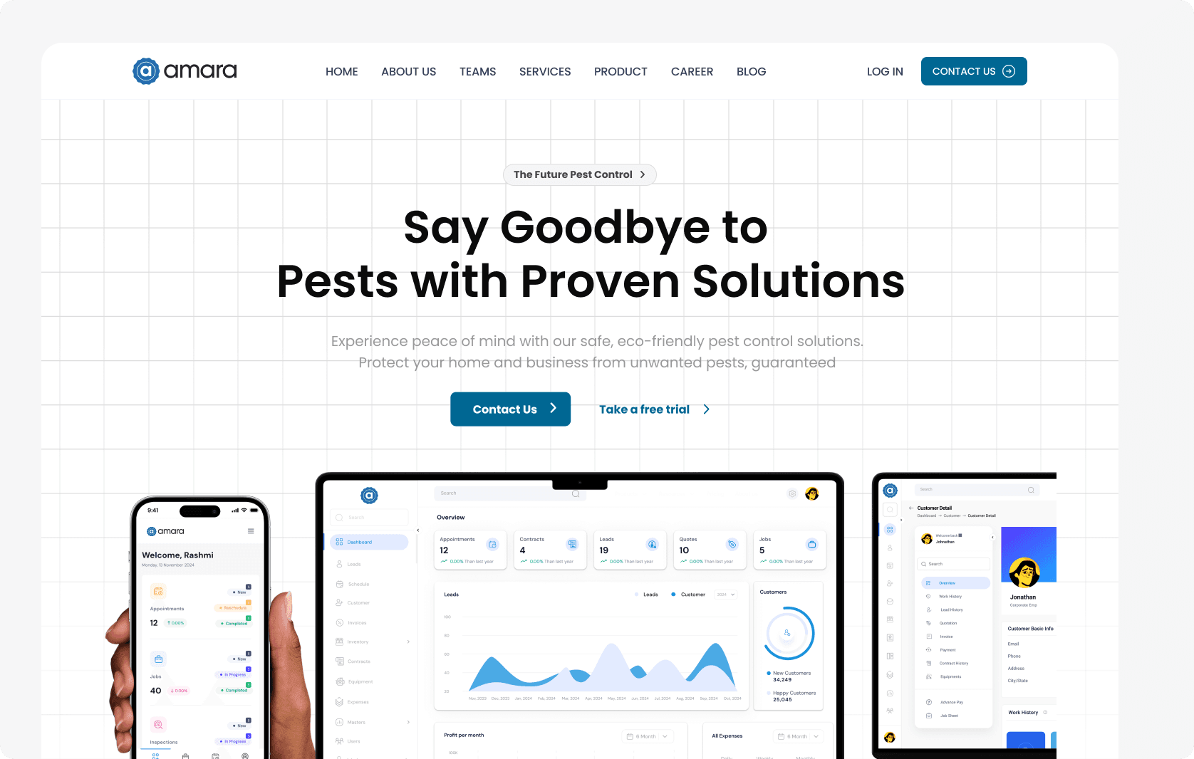
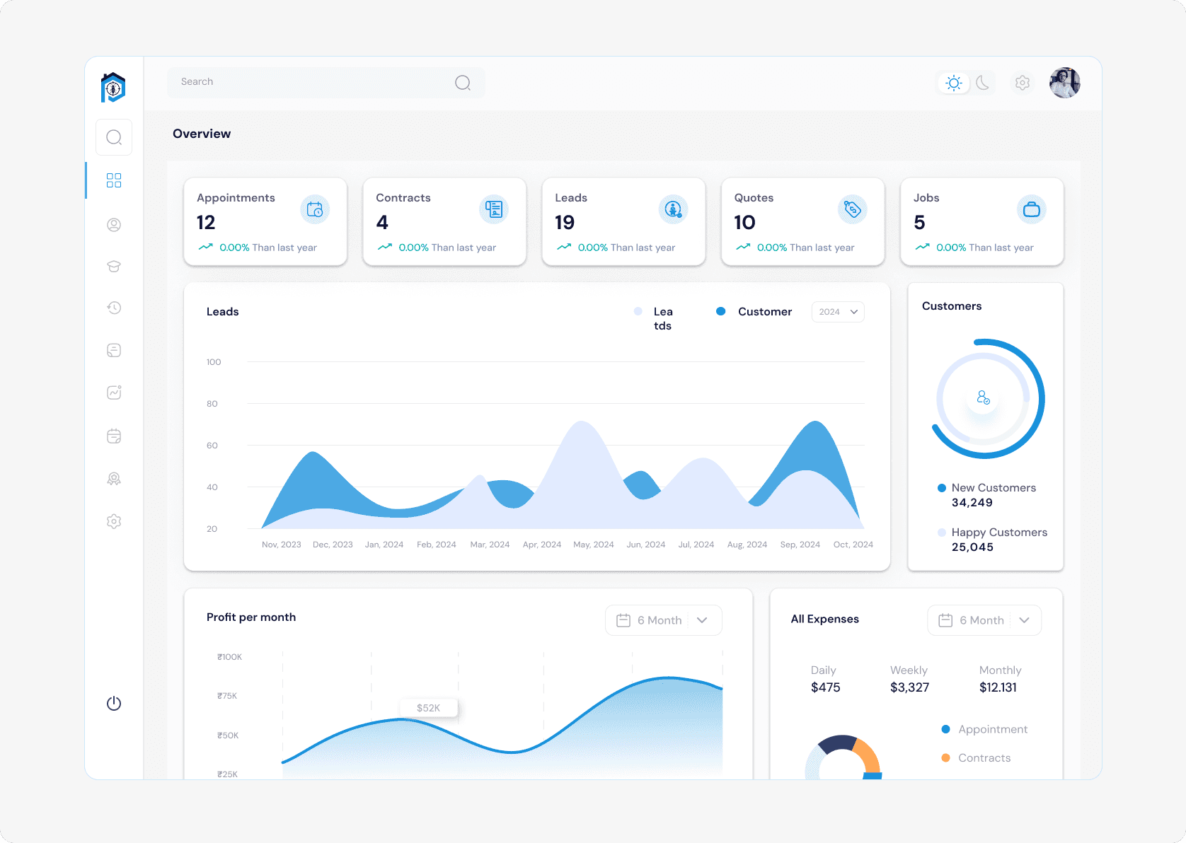
The Pest Control SaaS Dashboard and Landing Page is a comprehensive solution designed to streamline and optimize operations for pest control businesses. The project addresses the challenges faced by business owners, field workers, and administrators, offering a unified platform with powerful features for better productivity and efficiency.
The Pest Control SaaS Dashboard and Landing Page is a comprehensive solution designed to streamline and optimize operations for pest control businesses. The project addresses the challenges faced by business owners, field workers, and administrators, offering a unified platform with powerful features for better productivity and efficiency.
Overview
Overview
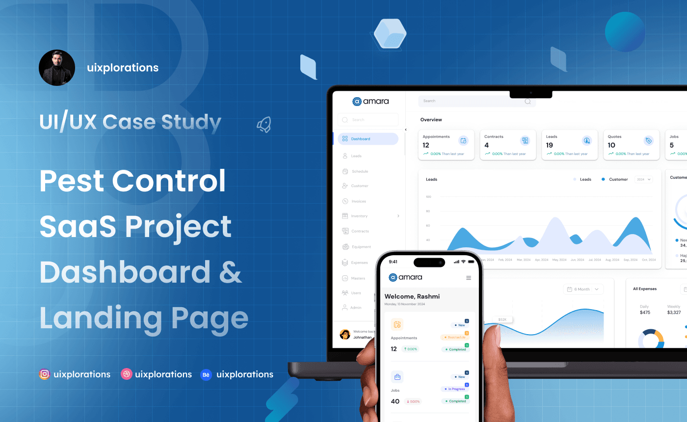
Pest control businesses often struggle with fragmented tools, inefficient workflows, and a lack of actionable insights. This project aims to streamline their operations by offering a unified platform that enhances productivity, simplifies processes, and provides real-time data for better decision-making.
Pest control businesses often struggle with fragmented tools, inefficient workflows, and a lack of actionable insights. This project aims to streamline their operations by offering a unified platform that enhances productivity, simplifies processes, and provides real-time data for better decision-making.
Pest control businesses often struggle with fragmented tools, inefficient workflows, and a lack of actionable insights. This project aims to streamline their operations by offering a unified platform that enhances productivity, simplifies processes, and provides real-time data for better decision-making.
Client
Client
Algorithus
Algorithus
Industry
Industry
IT
IT
Service
Service
UI / UX Design
UI / UX Design
Ux Writer
Ux Writer
Design Thinking
Design Thinking
Content
Branding
Duration
Duration
12 Weeks
12 Weeks
The Challenge
The Challenge
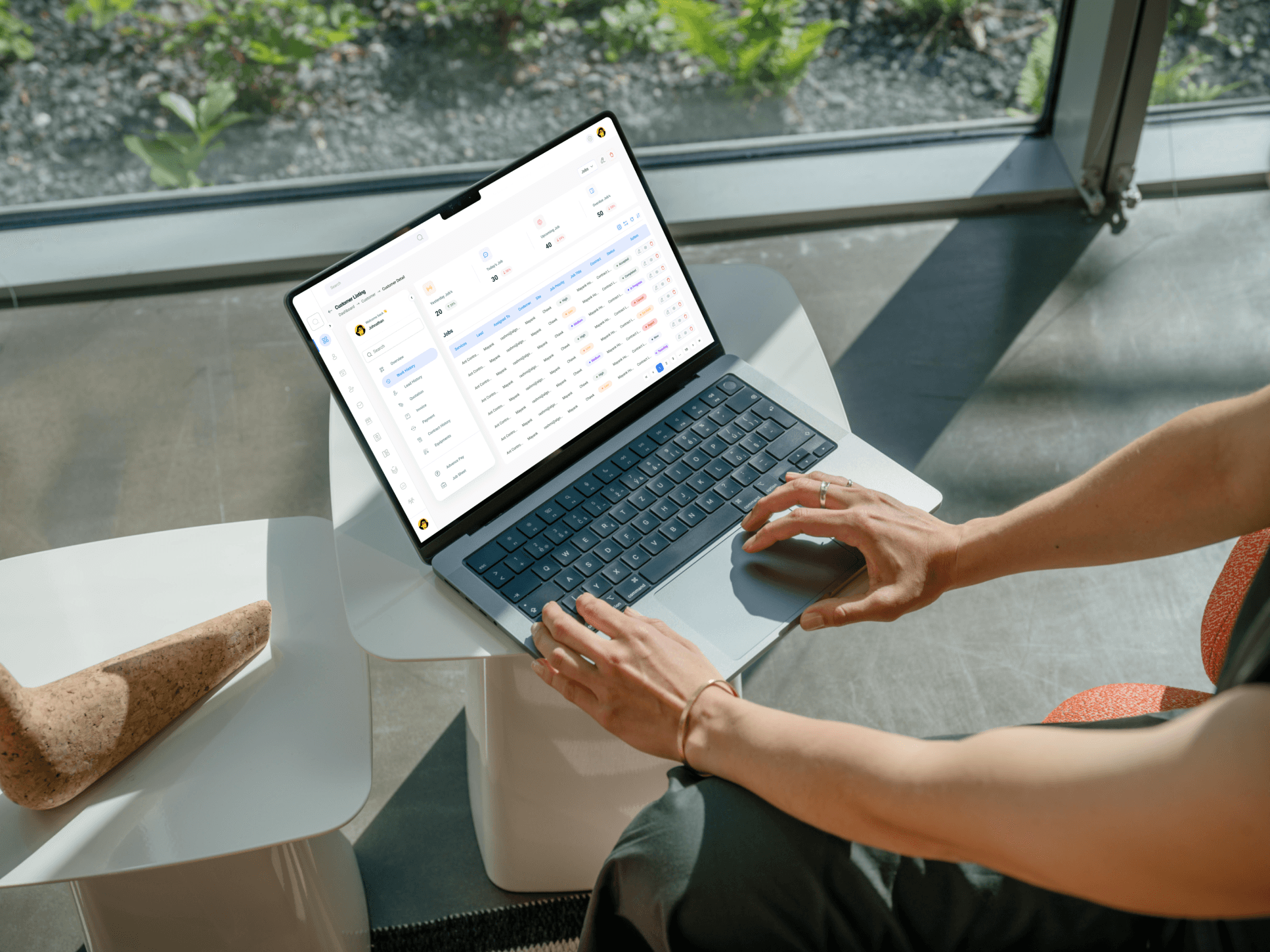
1. Balancing Feature-Rich Design with Usability Designing a platform with multiple functionalities (e.g., leads, jobs, invoices, scheduling, financial reports) without overwhelming the users was a key challenge. The goal was to create an interface that remained simple, intuitive, and easy to navigate while offering all the required features. 2. Creating a Seamless Mobile Experience Ensuring that field workers, who rely heavily on mobile devices, had access to an equally efficient experience as desktop users required a mobile-first approach. Designing for varying screen sizes and touch interactions added complexity to the process. 3. Incorporating Real-Time Updates The dashboard had to support real-time updates for job schedules, worker activity, and task progress. Crafting a system that provides seamless, live updates while maintaining performance was technically challenging. 4. Addressing Diverse User Needs The three primary user personas—business owners, field workers, and office administrators—had vastly different goals and pain points. The challenge was to cater to all their needs within a unified platform without making compromises on specific features. 5. Integrating Financial Insights Financial data is critical for business owners, but it needed to be presented in a way that was easy to interpret. Designing clear, impactful visualizations that made financial insights actionable required thoughtful data representation. 6. Ensuring Accessibility Accessibility features such as high contrast mode, font adjustability, and simple navigation had to be implemented without disrupting the visual design or usability. Balancing aesthetic appeal with functionality required careful consideration. 7. Designing a High-Converting Landing Page The landing page had to not only showcase the product’s value but also encourage users to sign up or make a purchase. Achieving a balance between engaging design, persuasive content, and seamless navigation was a strategic challenge. 8. Stakeholder Alignment Gathering insights from user interviews and aligning those with business goals and technical feasibility involved frequent iterations and feedback sessions to ensure everyone’s expectations were met.
1. Balancing Feature-Rich Design with Usability Designing a platform with multiple functionalities (e.g., leads, jobs, invoices, scheduling, financial reports) without overwhelming the users was a key challenge. The goal was to create an interface that remained simple, intuitive, and easy to navigate while offering all the required features. 2. Creating a Seamless Mobile Experience Ensuring that field workers, who rely heavily on mobile devices, had access to an equally efficient experience as desktop users required a mobile-first approach. Designing for varying screen sizes and touch interactions added complexity to the process. 3. Incorporating Real-Time Updates The dashboard had to support real-time updates for job schedules, worker activity, and task progress. Crafting a system that provides seamless, live updates while maintaining performance was technically challenging. 4. Addressing Diverse User Needs The three primary user personas—business owners, field workers, and office administrators—had vastly different goals and pain points. The challenge was to cater to all their needs within a unified platform without making compromises on specific features. 5. Integrating Financial Insights Financial data is critical for business owners, but it needed to be presented in a way that was easy to interpret. Designing clear, impactful visualizations that made financial insights actionable required thoughtful data representation. 6. Ensuring Accessibility Accessibility features such as high contrast mode, font adjustability, and simple navigation had to be implemented without disrupting the visual design or usability. Balancing aesthetic appeal with functionality required careful consideration. 7. Designing a High-Converting Landing Page The landing page had to not only showcase the product’s value but also encourage users to sign up or make a purchase. Achieving a balance between engaging design, persuasive content, and seamless navigation was a strategic challenge. 8. Stakeholder Alignment Gathering insights from user interviews and aligning those with business goals and technical feasibility involved frequent iterations and feedback sessions to ensure everyone’s expectations were met.
The Solution
The Solution
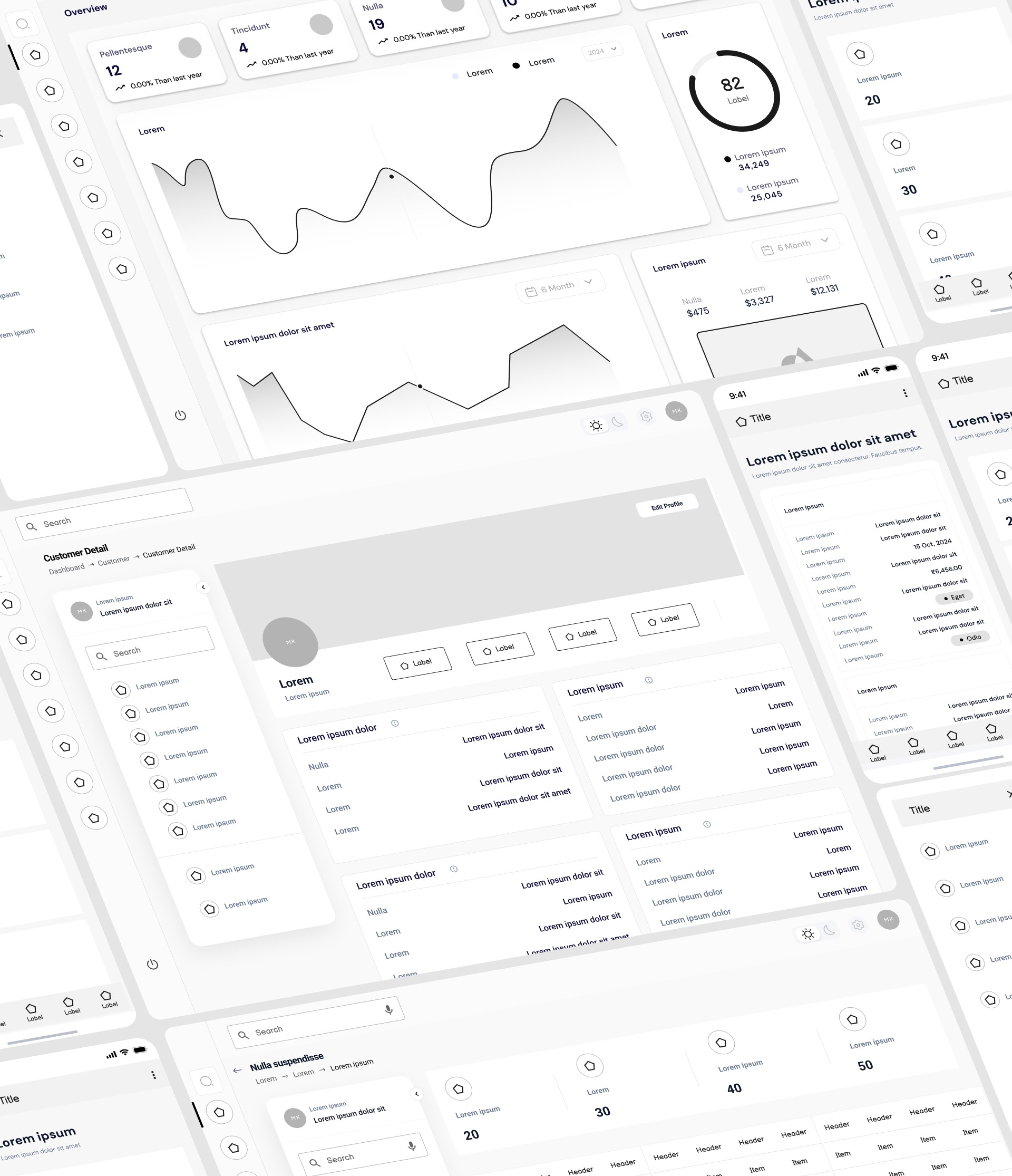
1. Balancing Feature-Rich Design with Usability Solution: Adopted a modular design approach to group related functionalities into intuitive categories (e.g., financials, tasks, insights). Used clean layouts, minimalistic icons, and consistent color schemes to avoid visual clutter. Implemented a dashboard hierarchy to display the most critical information upfront while allowing users to explore deeper details if needed. 2. Creating a Seamless Mobile Experience Solution: Designed a responsive mobile-first interface optimized for touch interactions. Simplified navigation by prioritizing essential features like job updates, scheduling, and task tracking. Ensured that the mobile version mirrored the desktop experience while being lightweight and fast. 3. Incorporating Real-Time Updates Solution: Designed a notification and update system that allows real-time synchronization between desktop and mobile platforms. Integrated clear visual indicators (e.g., badges, progress bars) to keep users informed about live changes in schedules, tasks, and job statuses. 4. Addressing Diverse User Needs Solution: Created detailed user personas to ensure every user’s needs were addressed. Customized dashboards for each persona—business owners, field workers, and office admins—so they could focus on the most relevant information. Implemented flexible filters, role-specific access, and feature prioritization for an optimized experience. 5. Integrating Financial Insights Solution: Developed dynamic charts and graphs to visualize financial data clearly. Incorporated drill-down functionality, allowing users to explore detailed reports with a single click. Used simplified terms and clear labels to make financial insights easily understandable. 6. Ensuring Accessibility Solution: Followed accessibility best practices, including offering high contrast mode, adjustable font sizes, and keyboard navigation. Conducted usability testing with diverse users to ensure the platform catered to different abilities without compromising the design. 7. Designing a High-Converting Landing Page Solution: Used a clear, persuasive value proposition in the headline and subheadings. Highlighted key features with interactive visuals and testimonials. Included prominent call-to-action (CTA) buttons like "Get Started" and "Explore Features." Designed a structured layout with seamless scrolling to keep users engaged. 8. Stakeholder Alignment Solution: Conducted regular design reviews with stakeholders and integrated feedback iteratively. Presented prototypes and interactive demos to ensure alignment between user expectations, business goals, and technical capabilities. 9. Testing and Validation Solution: Conducted usability tests with representatives from each persona group to validate design decisions. Addressed any feedback by refining the user interface, improving performance, and optimizing workflows to meet user expectations.
1. Balancing Feature-Rich Design with Usability Solution: Adopted a modular design approach to group related functionalities into intuitive categories (e.g., financials, tasks, insights). Used clean layouts, minimalistic icons, and consistent color schemes to avoid visual clutter. Implemented a dashboard hierarchy to display the most critical information upfront while allowing users to explore deeper details if needed. 2. Creating a Seamless Mobile Experience Solution: Designed a responsive mobile-first interface optimized for touch interactions. Simplified navigation by prioritizing essential features like job updates, scheduling, and task tracking. Ensured that the mobile version mirrored the desktop experience while being lightweight and fast. 3. Incorporating Real-Time Updates Solution: Designed a notification and update system that allows real-time synchronization between desktop and mobile platforms. Integrated clear visual indicators (e.g., badges, progress bars) to keep users informed about live changes in schedules, tasks, and job statuses. 4. Addressing Diverse User Needs Solution: Created detailed user personas to ensure every user’s needs were addressed. Customized dashboards for each persona—business owners, field workers, and office admins—so they could focus on the most relevant information. Implemented flexible filters, role-specific access, and feature prioritization for an optimized experience. 5. Integrating Financial Insights Solution: Developed dynamic charts and graphs to visualize financial data clearly. Incorporated drill-down functionality, allowing users to explore detailed reports with a single click. Used simplified terms and clear labels to make financial insights easily understandable. 6. Ensuring Accessibility Solution: Followed accessibility best practices, including offering high contrast mode, adjustable font sizes, and keyboard navigation. Conducted usability testing with diverse users to ensure the platform catered to different abilities without compromising the design. 7. Designing a High-Converting Landing Page Solution: Used a clear, persuasive value proposition in the headline and subheadings. Highlighted key features with interactive visuals and testimonials. Included prominent call-to-action (CTA) buttons like "Get Started" and "Explore Features." Designed a structured layout with seamless scrolling to keep users engaged. 8. Stakeholder Alignment Solution: Conducted regular design reviews with stakeholders and integrated feedback iteratively. Presented prototypes and interactive demos to ensure alignment between user expectations, business goals, and technical capabilities. 9. Testing and Validation Solution: Conducted usability tests with representatives from each persona group to validate design decisions. Addressed any feedback by refining the user interface, improving performance, and optimizing workflows to meet user expectations.
The Result
The Result
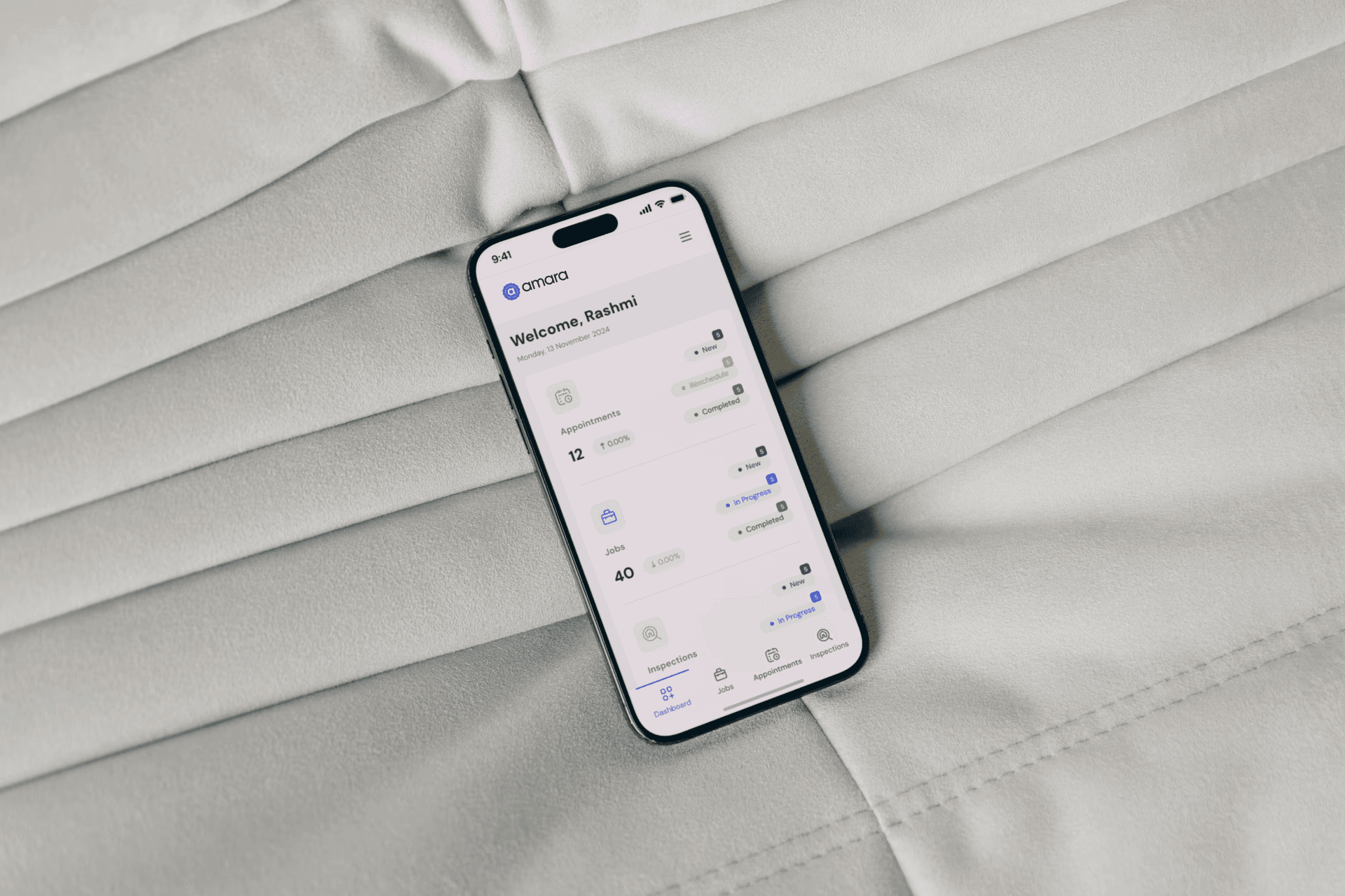
The SaaS Pest Control Dashboard successfully addressed the challenges faced by pest control businesses and delivered measurable improvements across various aspects of their operations. Key results include: 1. Improved Operational Efficiency Simplified task management and scheduling reduced administrative workload by 40%. Real-time updates ensured seamless communication between office administrators and field workers, cutting down task delays by 30%. 2. Enhanced Financial Visibility Dynamic financial dashboards provided actionable insights, enabling business owners to make data-driven decisions. Automated invoicing and expense tracking improved accuracy and reduced manual errors by 50%. 3. Increased User Satisfaction User-centric design led to a 90% satisfaction rate during usability tests. Field workers appreciated the mobile-friendly interface, reporting a 25% improvement in daily task completion rates. 4. Higher Engagement and Adoption The intuitive interface and modular design resulted in faster onboarding, with most users adapting to the platform within a week. The landing page achieved a conversion rate increase of 35%, with more users signing up for the software. 5. Scalability and Customization The modular structure and customizable features allowed the platform to cater to businesses of various sizes, enhancing its market appeal. Feedback-driven iterations ensured the software evolved with user needs, making it a long-term solution for pest control management.
The SaaS Pest Control Dashboard successfully addressed the challenges faced by pest control businesses and delivered measurable improvements across various aspects of their operations. Key results include: 1. Improved Operational Efficiency Simplified task management and scheduling reduced administrative workload by 40%. Real-time updates ensured seamless communication between office administrators and field workers, cutting down task delays by 30%. 2. Enhanced Financial Visibility Dynamic financial dashboards provided actionable insights, enabling business owners to make data-driven decisions. Automated invoicing and expense tracking improved accuracy and reduced manual errors by 50%. 3. Increased User Satisfaction User-centric design led to a 90% satisfaction rate during usability tests. Field workers appreciated the mobile-friendly interface, reporting a 25% improvement in daily task completion rates. 4. Higher Engagement and Adoption The intuitive interface and modular design resulted in faster onboarding, with most users adapting to the platform within a week. The landing page achieved a conversion rate increase of 35%, with more users signing up for the software. 5. Scalability and Customization The modular structure and customizable features allowed the platform to cater to businesses of various sizes, enhancing its market appeal. Feedback-driven iterations ensured the software evolved with user needs, making it a long-term solution for pest control management.